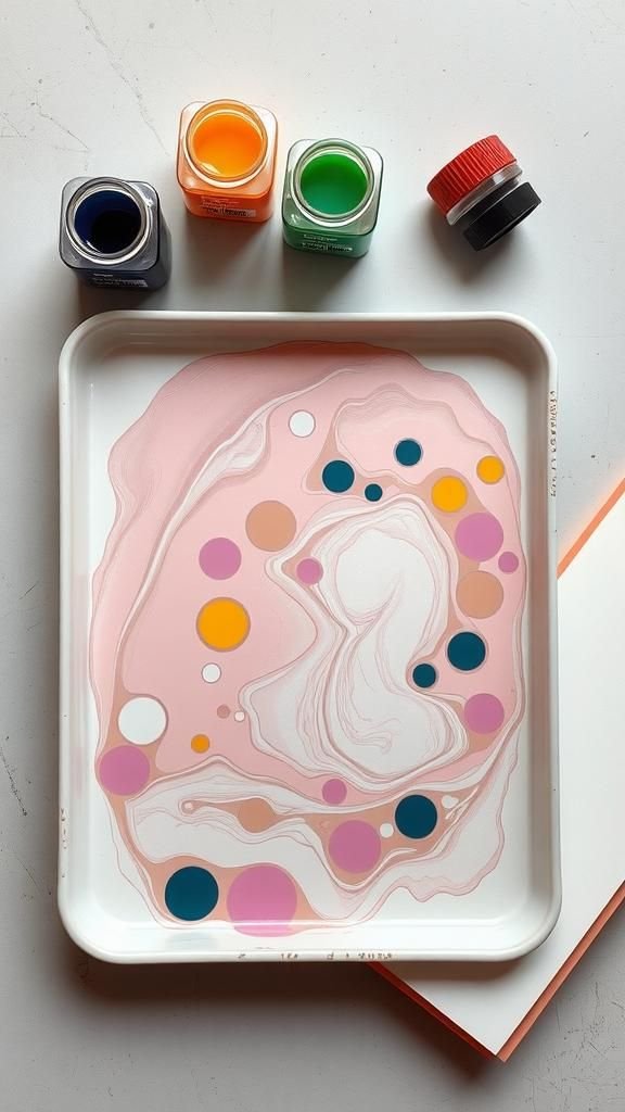
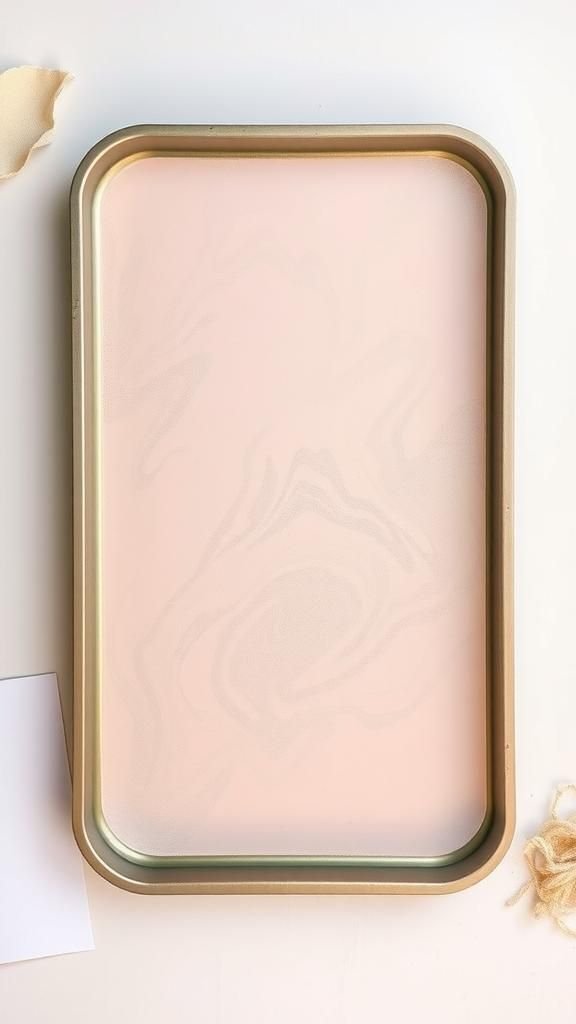
Marbled Paper DIY Techniques bring that mesmerizing drift of color to simple sheets, and I never tire of watching pigments float and bloom. The first time I tried DIY marbled paper, a single tray on my kitchen table turned into a mini studio, and those wavy lines felt like a tiny miracle.
Paper marbling techniques turn waiting time into a calm pause, and each pull becomes a small surprise.
Since then, Marbled Paper DIY Techniques have become my go-to for gifts, notes, and wall pieces. DIY marbled paper feels playful yet polished, and the results carry a mix of control and chance that keeps me coming back.
Even small experiments with paper marbling techniques can transform scraps into keepsakes.
Suminagashi: Whisper-Light Rings On Still Water

This minimalist method floats ink on plain water, forming airy rings that drift and intersect with poetic ease. A simple palette of black sumi ink and a surfactant creates feathered lines that feel meditative rather than bold.
Textured rice sheets, kozo, or lightweight drawing sheets welcome the delicate patterning and hold soft veils of gray where the ink thins. Pale backdrops highlight the brushlike energy, while warm off-whites add a serene, archival vibe.
Pieces mount elegantly in narrow frames, wrap small gifts with quiet luxury, or pair with plain envelopes for understated correspondence that still feels personal.
Steps
- Fill a shallow tray with clean water and let it settle.
- Touch drops of sumi ink and a surfactant to the surface to form rings.
- Agitate gently with breath or a pointed tool to encourage movement.
- Lay paper on the surface briefly, lift smoothly, and rinse lightly.
Traditional Ebru On Carrageenan Size

Carrageenan gel supports lively pools of color that hold shape long enough for fine patterns. Acrylic colors prepared for marbling sit atop the surface, expanding into crisp edges and saturated blooms.
A treated sheet meets the gel with clean pickup, capturing feathery tendrils and controlled veining. Classic tones of teal, cinnabar, saffron, and indigo echo Ottoman palettes, while contemporary palettes with blush, charcoal, and sage introduce a modern mood.
Finished sheets look graceful as notebook covers, framed panels, or drawer liners, bringing heritage charm to small home corners and keepsake gifting.
Steps
- Blend carrageenan with water and let the gel rest until smooth.
- Drop marbling acrylics on the surface and allow them to spread.
- Pattern with stylus, rakes, or combs to form desired motifs.
- Lay treated paper onto the gel, lift, and rinse off excess size.
Shaving Cream Swirls For Low-Mess Prints

Airy foam acts like a cushion, keeping colors suspended for playful swirls and soft blends. Ink or liquid color skims the surface, forming ribbon-like bands with a velvety texture that reads almost pastel.
White grounds keep the palette fresh, though kraft sheets introduce pleasing contrast and a hint of casual charm. Because the base wipes away after transfer, finished sheets feel smooth and bright.
These marbles make cheerful greeting cards, journal pockets, or party place cards, and they box well as a mini set of patterned note papers for thoughtful sharing.
Steps
- Spread a layer of shaving cream in a shallow pan.
- Drip liquid watercolor or ink onto the foam.
- Marble the color with a stick or comb to form swirls.
- Press paper onto the surface, lift, and scrape away foam.
Oil And Water Marbling For Dreamy Veins

Lightweight oils mingle with colorants, floating in puddles that resist the water below and form organic islands and branching streams. Smooth drawing sheets accept the pattern with an enchanting translucence, while thicker watercolor sheets produce bolder edges and slight relief where pigment gathers.
Earthy palettes with ochre and sienna feel warm and sunlit; jewel tones suggest a glassy lagoon mood. Finished pages look striking layered as collages, inserts for invitations, or wrapped around small boxes where the veining glints under angled light like agates on a shoreline.
Steps
- Fill a tray with water and add a few drops of dish soap.
- Mix color with a small amount of lightweight oil in a cup.
- Drizzle the oily color over the water and swirl gently.
- Place paper on top, lift slowly, and lay flat to dry.
Nail Polish Marble With Glossy Drama

Fast-moving polish creates glassy puddles that spread into striking streaks and smoky eddies. Bold contrast defines this approach, where black, white, and metallic flecks pop against pale sheets.
Slightly coated papers enhance the high-gloss effect and preserve crisp edges. Iridescent polish adds a subtle color shift, catching light as the sheet moves.
The finished look suits statement gift tags, small art prints, and glamorous card fronts. A few coordinated sheets stack beautifully in a ribbon-tied bundle, turning leftovers into a luxe present that feels ready for an instant gallery wall.
Steps
- Work near ventilation and fill a disposable tray with water.
- Drip nail polish onto the surface and swirl with a stick.
- Lay paper onto the polish, lift promptly, and set aside.
- Allow to dry fully before flattening under books.
Methyl Cellulose Size With Watercolor Inks

A silky methyl cellulose bath slows pigment spread, granting graceful blooms with neat boundaries. Fluid watercolor inks rest on the surface and drift into marble fields that feel airy yet controlled.
Warm cotton sheets or heavyweight watercolor bases show tiny feathered edges and subtle granulation, while brighter white sheets bring crisp clarity. Soft palettes with lavender, seafoam, and smoke gray carry a calming mood, perfect for mindfulness journals.
Pages display nicely in shadow boxes, while offcuts become layered collage bits for bookmarks and mini art trading pieces.
Steps
- Hydrate methyl cellulose powder with water and let it set.
- Drop watercolor ink on the surface and watch it expand.
- Shape patterns using a stylus, comb, or gentle breaths.
- Lay alum-treated paper on top, lift, and rinse the size.
Alum-Prepped Paper For Crisp, Vivid Pickup

Treating sheets with alum primes fibers to welcome color with clean edges and richer saturation. This quiet step shifts the feel from hazy to defined, helping swirls hold their shape even in busier patterns.
Smooth drawing sheets, hot-press watercolor, or lightly sized cotton papers respond with impressive clarity while retaining the gentle drift that makes marbling so alluring. Neutral-toned papers take on a gallery-quality finish after treatment, ready for tidy borders and modern matting.
The improvement shines in stationery sets, where consistent pull quality elevates envelopes, letter sheets, and note cards.
Steps
- Dissolve alum in warm water and let it cool.
- Brush or sponge the solution onto paper evenly.
- Hang or lay sheets to dry completely before marbling.
- Proceed with your preferred marbling bath and print.
Classic Stone Pattern With Pebbled Texture
A stone pattern forms rounded droplets that cluster like riverbed pebbles, each with its own halo and density. The look balances order and spontaneity, bringing rhythm to colored fields without feeling stiff.
Muted grounds of taupe, moss, and smoke with one strong accent color keep the eye moving. Lightweight combing adds gentle overlap, giving mixed sizes and subtle stacking.
This approachable pattern suits notebook covers, folio liners, and envelope flaps, while partial sheets trim into tidy bands for wrapping and binding accents on handmade journals.
Steps
- Float color drops across the size to form scattered circles.
- Add contrasting drops inside existing circles for layered pebbles.
- Lightly tap the tray to settle and round the shapes.
- Lay the treated paper on the bath, lift, and rinse.
Gel-Git Waves: Back-And-Forth Harmony
Gel-git lines sweep color in parallel bands that echo tide movements across a shore. The method highlights linework and spacing, showing how discrete colors interact while remaining legible.
Contrasts between light and dark produce pleasing cadence; earth tones render calm, while bright duos lend a nautical vibe. Subtle overpasses with a comb introduce layered cadence without losing the tidy structure.
Sheets with this pattern excel as endpapers, spine wraps, and portfolio liners, offering a classic nod to bookbinding history while pairing easily with modern covers.
Steps
- Drop colors to cover the size with evenly scattered spots.
- Draw a stylus across the tray in one direction repeatedly.
- Repeat strokes back in the opposite direction to build bands.
- Print with treated paper and rinse away the size.
Nonpareil Pattern With Rake-Set Rhythm
Raked color beads into finely spaced scallops that read like a tidy textile. The interplay of narrow spacing and repeating arcs gives refined structure, perfect for book interiors and decorative wraps.
A restrained palette keeps the motif calm; a splash of complementary contrast grants lively sparkle without visual overload. Smooth, well-prepped sheets reward the pattern with sharp definition and a gentle sheen after finishing.
A bundle of coordinated nonpareils makes a thoughtful stationery gift, easily tied with twine and paired with plain envelopes for balance.
Steps
- Float a full layer of colors across the size.
- Pass a comb or rake evenly in one direction.
- Follow with a perpendicular pass to set scallops if desired.
- Print onto treated paper and rinse to reveal the pattern.
Peacock Eyes With Spiraled Flourishes

This flourish pattern drops small eyes within larger circles, then swirls them into whimsical spirals. It reads as ornate without feeling heavy, especially when kept to a balanced palette of two or three hues plus a grounded neutral.
Metallic accents in gold or copper whisper along the edges for a hint of shimmer. Sheets with peacock eyes frame beautifully in narrow mats or cut down into bookmarks where each strip becomes a tiny panorama.
The design brings an elegant flourish to event menus and keepsake boxes.
Steps
- Lay down broad color fields on the size.
- Drop smaller contrasting spots into larger ones to form eyes.
- Twirl a stylus through each eye to create spirals.
- Transfer the pattern to treated paper and rinse clean.
Bouquet Ebru: Petals And Stems On Marble

Florals bloom over soft grounds, where petals and leaves rise from layered droplets that turn into stems with a few guided strokes. Pastel backdrops support delicate flower heads, while midnight grounds set a dramatic garden stage.
The motif pairs with textured cotton paper that holds fine lines and gentle shading. A small suite of related blooms makes enchanting greeting sets, while full sheets shine as framed botanicals.
Light metallic flecks along petal edges add morning dew energy without overwhelming the airy field beneath.
Steps
- Prepare a calm background on the size with blended tones.
- Add petal and leaf droplets in planned clusters.
- Draw stems and petal shapes with a thin stylus.
- Lay treated paper to pick up the floral composition.
Overmarbling For Layered Color And Movement
Overmarbling lays a second pattern on a previously printed sheet, weaving fresh motion through the earlier design. Translucent inks allow the underlayer to glow, while opaque stripes or scallops introduce bold contrast.
Harmonious palettes build depth without noise; high-contrast choices inject energy for statement pieces. The layered result carries a tapestry quality that looks rich in frames or as cover stock for handmade albums.
Scraps trimmed into tags reveal little vignettes of intersecting swirls, ideal for gift wrapping with simple twine and kraft bags.
Steps
- Start with a dry, previously marbled sheet.
- Prepare a new bath and float a lighter pattern.
- Lay the sheet onto the second pattern and lift.
- Dry flat and press gently under weight to smooth.
Metallic Veins For Luminous Highlights

Metallic inks trail along edges and seams, catching light with a refined glimmer that changes as the sheet tilts. Gold warms earthy palettes, silver cools ocean schemes, and copper adds a burnished glow to autumn tones.
Subtle placement keeps the marble readable while elevating the finish. Smooth, bright papers enhance the sheen, while natural-fiber sheets introduce a soft, antique feel.
Finished pieces shine in gallery-style frames with narrow mats, or as belly bands around journals where the metallic threads act like jewelry for paper.
Steps
- Float standard colors on the bath and form a pattern.
- Introduce metallic ink sparingly along edges and lines.
- Stir gently to coax fine veins without flooding.
- Print onto prepared paper and let it dry fully.
Monochrome Marbling For Elegant Tonal Harmony

A single hue in multiple strengths, from whisper-light to inky dark, gives a cohesive field that feels calm and refined. The eye stays on movement rather than clashing accents, ideal for minimalist interiors and quiet stationery.
Cool grays and charcoal build a graphite-like flow; warm sepias evoke old photographs and tea stains. Crisp white paper keeps the effect modern, while cream sheets lend softness.
Monochrome sets tie neatly with linen ribbon, ready as a thoughtful host gift or a curated stash for journal spreads and collage.
Steps
- Mix one hue into multiple dilutions for range.
- Float the tones across the bath to full coverage.
- Add gentle combing or stylus work to define motion.
- Transfer onto prepared paper and dry under light weight.
Masking And Resist Shapes For Bold Silhouettes

Crisp silhouettes emerge where the sheet resists color, leaving clean shapes against swirling grounds. Letterforms, leaves, and geometric windows read clearly without overwhelming the marble beneath.
High-contrast color behind open spaces amplifies the drama, while soft palettes add a poetic vibe. Smooth cardstock behaves predictably, holding neat edges around the masked zones.
Finished sheets look striking as posters, wedding signage backgrounds, or layered covers where cutouts reveal contrasting papers below. Small pieces punch into tags that carry a playful peek-through moment on wrapped gifts.
Steps
- Apply removable masking to the paper in chosen shapes.
- Marble a lively background pattern on the bath.
- Print the paper so color surrounds the masked areas.
- Remove masking after drying to reveal clean silhouettes.
Ghost Prints: Second Pulls With Soft Echoes
After a strong pull, faint remnants linger on the bath, ready to yield a gentle echo. These ghost prints feature milky washes, pale seams, and unexpected gaps that read like fog drifting across a shoreline.
Pastel or neutral palettes suit the soft character, though a hint of metallic threads adds glints along the pale paths. Lightweight writing sheets flatter the subtlety and fold into airy note cards that whisper rather than shout.
Sets of ghost prints, bundled with plain envelopes, feel like a quiet letter to the future.
Steps
- Complete a first print and clear only heavy residue.
- Lay a fresh sheet onto the remaining pattern.
- Lift carefully to capture the pale echo.
- Dry flat and press lightly for smoothness.
Recycled Papers And Everyday Surfaces

Old envelopes, catalog pages, and brown paper gain fresh life when dressed in flowing color. Slightly toothy surfaces invite intriguing granulation, while smooth letter sheets hold crisp lines.
Subdued inks turn newsprint into collage fodder with a vintage vibe, and bold hues brighten grocery bag panels for eco-minded wrapping. Contrasting thread ties and kraft bands present bundles as charming gift sets.
Mixing textures in a single project adds character, proving that humble materials can join the celebration and return to desks, shelves, and mailboxes with renewed purpose.
Steps
- Sort and flatten clean recycled sheets.
- Test a small piece to observe how it takes color.
- Marble in your preferred bath and pattern style.
- Dry thoroughly and trim edges for neat stacks.
Eco-Minded Marbling With Natural Pigments

Plant dyes and mineral tints bring muted, earthy palettes that feel grounded and timeless. Soft sage, rust, indigo, and walnut hues settle into gentle gradients with a hand-hewn quality.
Cotton rag paper pairs beautifully, its fibers holding subtle speckle and soft edges. The result favors calm interiors and journal work, where the color story complements linen covers, wood frames, and unbleached envelopes.
Bundles of these sheets look handsome tied with hemp cord, and the palette plays well with pressed leaves or dried grasses in simple displays.
Steps
- Prepare a clean size suitable for delicate pigments.
- Introduce natural tints and observe their spread.
- Shape a modest pattern to preserve tonal nuance.
- Transfer onto rag paper and dry slowly away from heat.
Stationery Suite: Envelopes, Cards, And Inserts

Coordinated sheets turn into a cohesive paper wardrobe for notes and events. Lighter marbles for writing sheets keep legibility intact, while bolder covers and liners add ceremony when an envelope opens.
Accent colors echo across belly bands, seals, and small inserts. Smooth paper plays nicely with fountain pens; softly textured stock adds tactile warmth.
A boxed set arranged by tone feels giftable on its own, and mismatched mixes convey an artist’s desk energy that invites letters, lists, and tiny collages to flourish.
Steps
- Marble a range from subtle to bold patterns.
- Cut panels for card fronts and envelope liners.
- Pair with matching blanks and coordinating seals.
- Bundle sets in a tidy box or band.
Book Fore-Edges With Marble Magic

Decorated fore-edges lend old-world charm, turning a stack into a miniature gallery. Softly repeating stripes and wave motifs suit the long, narrow format, while restrained palettes keep the effect refined on a shelf.
Smooth, uncoated page edges welcome color evenly and dry to a pleasant satin. Classics shelved with marbled edges gain a boutique look, and journals carry a hint of history alongside modern covers.
A wrapped set with matching endpaper offcuts finishes the package for readers and stationery enthusiasts alike.
Steps
- Clamp the book so the page block sits even and tight.
- Mask covers and spine to protect them.
- Marble the exposed fore-edge with a controlled pattern.
- Release clamps and let the pages fan dry gently.